
STORYTELLERS

Here's to the crazy ones. The misfits. The rebels. The troublemakers. The round pegs in the square holes. The ones who see things differently.
They're not fond of rules. And they have no respect for the status quo. You can quote them, disagree with them, glorify or vilify them. About the only thing you can't do is ignore them. Because they change things. They push the human race forward.
And while some may see them as the crazy ones, we see genius. Because the people who are crazy enough to think they can change the world, are the ones who do.
In the late 1990s, Apple ran an advertising campaign which not only summed up the company’s ambitions at the time, but defined heart and soul of their efforts for the next 20 years.
The ‘Think Different’ campaign was not just haughty-sounding advertising jargon. The slogan and accompanying manifesto told a story about Apple; where they were, who they wanted to be, and what kind of customer they were speaking to. It celebrated the outlier and spoke to a generation of artists, filmmakers, songwriters and dreamers who grew up in the confusion and drama of the 1980s.
To really hammer this point home, the TV and print ads featured a montage of famous ‘crazy ones’ — including Albert Einstein, Bob Dylan, Martin Luther King Jr., John Lennon, Mahatma Gandhi, Amelia Earhart, Pablo Picasso, Thomas Edison, and many more. It was a roll-call of creative and courageous visionaries and rebels.
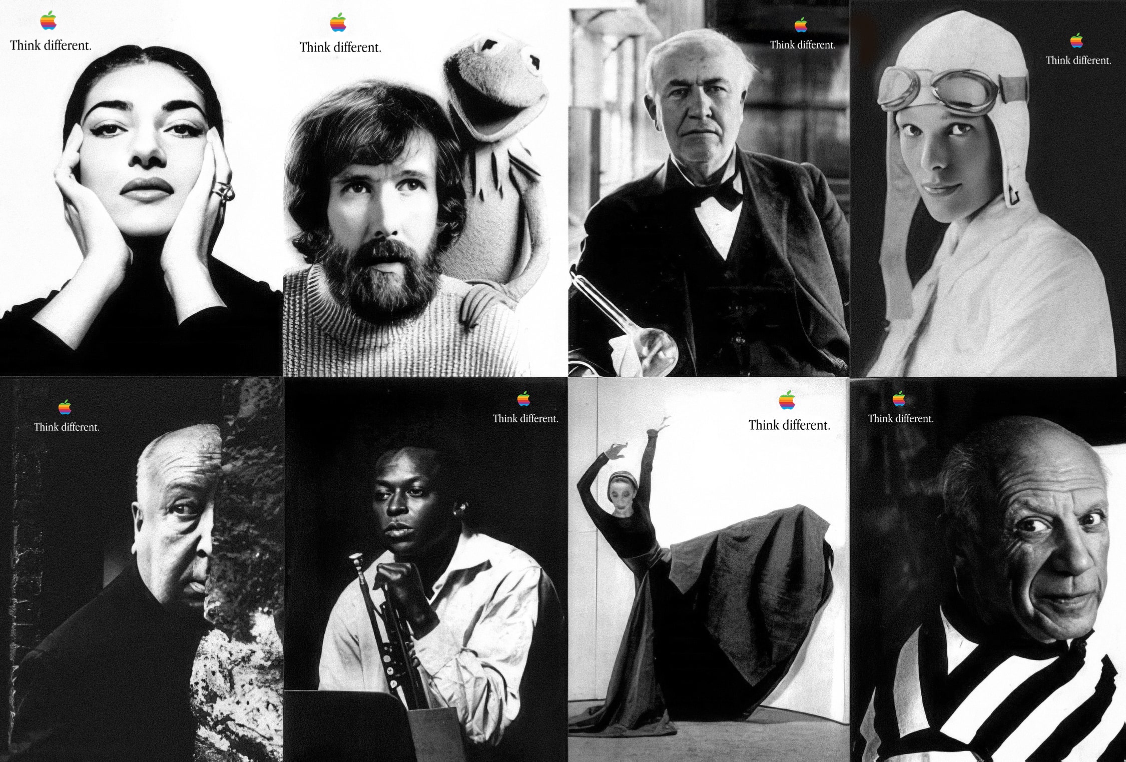
It's no surprise that Steve Jobs loved the campaign. His goal for Apple had always been to 'sell dreams' and to do that, he knew that Apple needed great storytelling.
Clearly, Apple found it, and 'selling the dream' is a talent which Apple has cultivated carefully over the years and never let slip. From the 1980s right up to today, from the original Macintosh launch in 1984 to Vision Pro in 2023, Apple has consistently used storytelling to create emotional connections with its audience, with product launches not just about specs and features; but tales which resonate with people's aspirations and values.
This is not a novel concept, of course. Car, cologne and beer companies all clued into the fact long ago that to sell a product well, that product needs to represent a lifestyle. What sets Apple apart is that their storytelling is not limited to marketing material, but has been quietly woven into their product line and ecosystem.
This year, Apple is going to release MacOS 26 (Tahoe), which introduces a new design language called 'Liquid Glass'. This is not just a gimmick or visual overhaul; it’s narrative development. It's Apple's way of signalling its ongoing commitment to innovation, user experience, and design excellence. And perhaps more importantly than that, it's about showing users the future of computing — or at least the future that Apple wants.
Liquid Glass is a triumph of UI design. A mix of solid and fluid, an ode to playful elegance, and a replication of real-world physics in the digital space — and that last point is important.
With the introduction of Vision Pro, Apple aimed to changed the way we think about computing. This device embraced a new way of interacting with digital content, blending the physical and virtual worlds, and signalling depth with shadow, transparency, translucency, and movement. Apple clearly wants to carry this new paradigm into its other products. Liquid Glass is therefore not just a big step forward in user interface design, it’s a way for Apple to tell their story about the future of computing and get people ready for what's coming next.
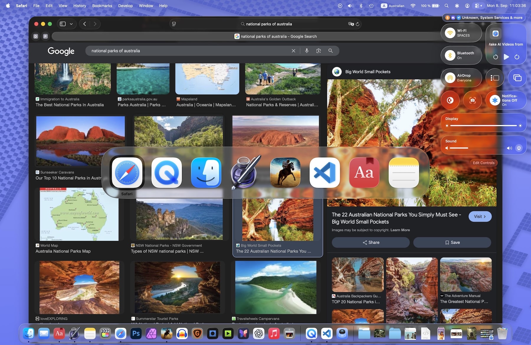
Of course, Apple has its critics. Since the announcement of Liquid Glass, howls of indignation have erupted across the internet, with some pointing out that the update is an 'accessibility nightmare!' with low readability or poor contrast (complaints which must willfully be ignoring the fact that Apple has for a very long time had perhaps the best Accessibility options in the entire tech sphere, with settings galore for altering the OS to be more readable or higher-contrast or so forth). Or that it's gimmicky and 'too like Windows 11', which is not a little insulting to Apple's design team…
It's often said that since Steve Jobs passed away in 2011, Apple has lost its way. That it has 'stopped innovating' or can't produce revolutionary products anymore. This, in my opinion, is absolute nonsense. Apple under Tim Cook has been fantastic.
Consider the Apple Watch, Airpods, Vision Pro, the M-series chips, the seamless ecosystem features like Handoff, Face ID, Continuity Camera, Live Translation, AI‑powered tools (alright, that's still being ironed out), all of which have appeared under Cook's tenure. Cook has overseen the biggest period of growth in Apple's history, and the company is now the first to reach a $3 trillion market cap. Not bad for a company that's supposedly 'losing its way'.
To me, MacOS Tahoe is another example of Apple’s ongoing commitment to innovation and product excellence. Despite all the criticism and bluster out there, actually using the updated OS is a joy. On iPad and iPhone, elements move and flow and respond to your touch in a way that feels natural and intuitive and fun, while on the Mac, things are toned down a little but still look absolutely 'lickable', as Steve Jobs once put it. The OS feels cleaner, snappier, and feels ready for the future in a way that, as usual, is going to be mighty hairy for the competition to try and copy (though they will undoubtedly try).
In fact, a strange thought occurred to me when it was announced; that in a way we've come full-circle. 25 years ago in 2000, Apple introuced 'Mac OS X', its tenth Operating System and complete re-write using a flashy new Unix core. The OS featured an interface called 'Aqua' which — as the name implies — was inspired by water.
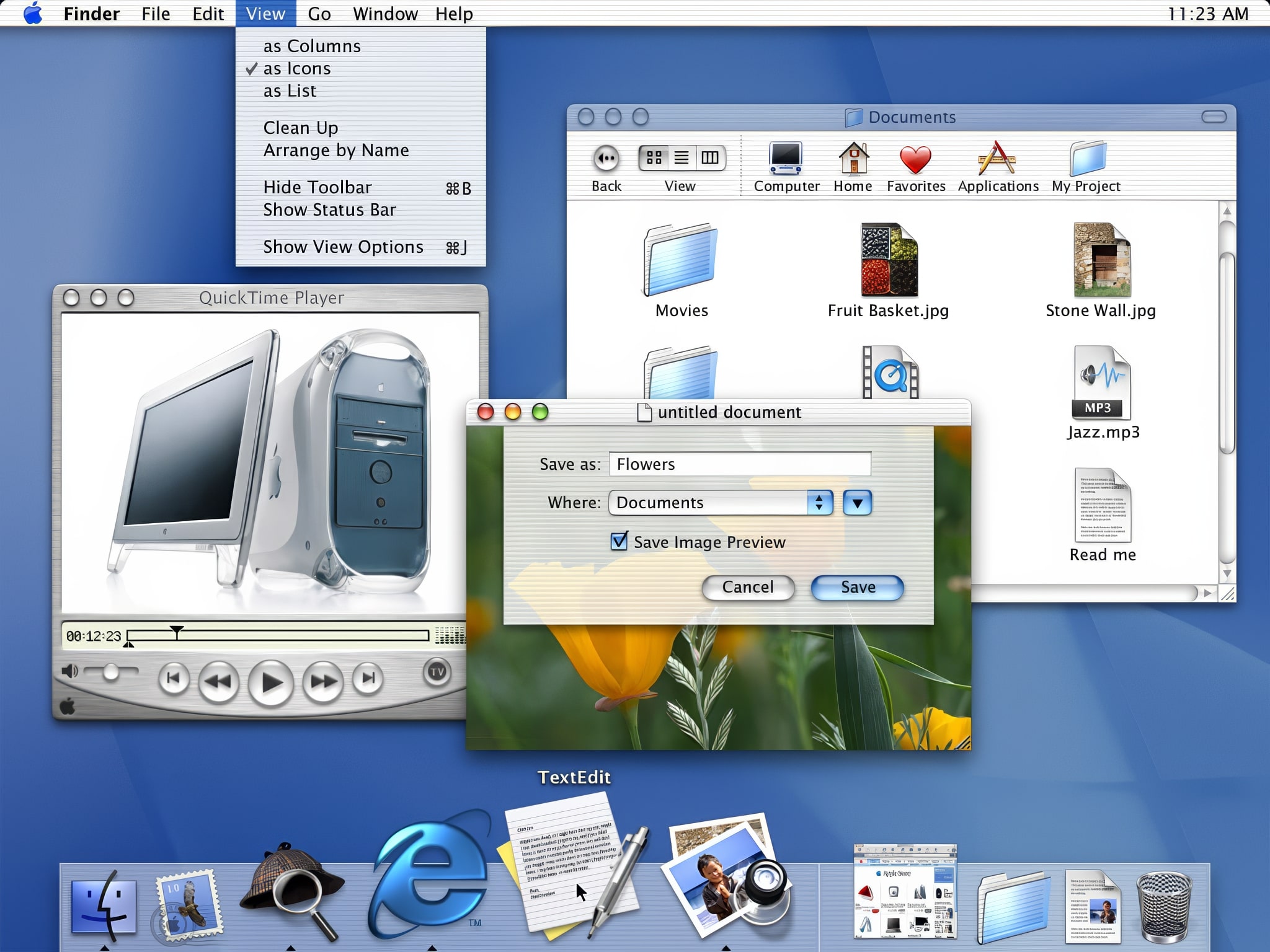
It looked amazing at the time. Corners were rounded, icons were translucent and glossy, and the whole thing felt fresh and new. It was a big leap forward from the old 'Mac OS 9', which by comparison felt clunky and primitive. And yet, Aqua was limited by the technology of the time. Screens were smaller, processors were weaker, and the best Apple could pull off in terms of fluidity was the 'genie' effect when minimising windows.
Now, 25 years later with Liquid Glass, it seems that Apple is finally able to realise that original vision in a way that feels modern and relevant. Indeed, my first thought upon seeing Liquid Glass was, 'this is the Aqua Steve wanted.'
The homage is poetic. Both the end of a story, and a whole new beginning for Apple.